Facebook’s Video Player Isn’t Designed for You
 Medium

The social network prioritizes “engagement” over enjoyment in video — hurting publishers and users alike
From the outside, it’s hard to know what, exactly, Facebook wants from its video platform. For years, the company told publishers that video was the future, even as it allegedly goosed statistics behind the scenes to make the format look more important than it was. In 2017, the social network rolled out a major update to its video player that added a kind of picture-in-picture mode to the News Feed, among other changes, in an effort to make “watching video on Facebook richer, more engaging and more flexible,” according to the company. Then last year, Mark Zuckerberg announced the company would de-prioritize video from brands in favor of content that “encourage[s] meaningful interactions.”
The message seemed clear: Time spent watching video doesn’t matter to Facebook if people don’t also like, comment, and share those videos. In that statement, Zuckerberg referenced “connecting” or “interacting” with people nine times while disparaging what he called “passive” viewing twice. His model offers a curious contrast to most video platforms, which have been passive by nature since the Lumière brothers put on the first public screening of motion pictures in 1895. When you go to a movie theater, there’s nothing to engage with but the screen in front of you. (Keep that phone in your pocket, please.)
Netflix has tried and failed to become more social, and its video player is still a sit-back experience, Bandersnatch notwithstanding. Even YouTube, notorious for its unruly comment sections, keeps most of its social features below the fold.
So how can Facebook encourage “meaningful interaction” with content that seems meant to be viewed passively? The design of its video player offers a clue. Where most video platforms make the ritual of “Like, Share, and Subscribe” an optional step after you view a video, Facebook’s video player guides users to engage first.
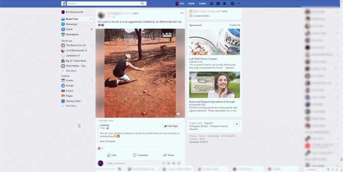
Consider this scenario: You’re scrolling through Facebook on your computer and find a video your friend has shared. You click on the video to start playing it. After watching a bit, you need to pause for a second. How would you do it? In players like Netflix, YouTube, and Vimeo, you can click anywhere on the video to pause. Facebook takes a different approach. Click on the video in your Facebook feed, and this will happen:

The video enlarges and redirects to a page with a large “How People Reacted” section on the right side in addition to the usual comment section below. Prominent “Like,” “Comment,” and “Share” buttons appear directly below the video along with a tally of how many people have interacted with it.
This new section leads to the original source of the video: If your friend shared a clip from LADbible’s page, for example, tapping the video brings you to that publication’s original post. You’re no longer in a feed populated by your Facebook friends but on a comments page filled with strangers. It’s hard to describe this as “meaningful,” to draw on Zuckerberg’s favorite word, but it is certainly an “interaction.”
A similar thing happens if you attempt to full-screen a video from your feed. While most video players have a full-screen button — usually denoted with arrows or brackets indicating the corners of your screen — Facebook only has an “Enlarge” button with two arrows pointing to the corners. Click this, and you might expect the video to go full screen, but instead the same reaction occurs: You’ll be hit with a slightly larger video and much more prominent engagement buttons. Only then can you click another button to go truly full-screen, but Facebook doesn’t want you to forget that the option to engage is there — always.
Even if you scroll on from a video in the News Feed, it’s difficult to disengage. On other scrollable platforms like Twitter or Facebook’s own Instagram, you can click on a video to play it, but scroll onwards and the video will go away. Not so on Facebook.
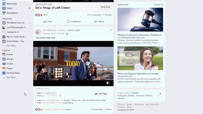
Keep your eye on upper-right corner in the clip below:

The video follows you as you scroll through your News Feed. And in the bottom right corner of that mini player are “Like” and “Share” buttons. These buttons take up more real estate inside the mini player than any other button (including the “X” in the top-right corner that dismisses the video).
It’s hard to say whether this video player has been intentionally designed to funnel as many people into engaging as possible or if it’s just a clumsy interface. The company did not respond to multiple requests for comment.
Whatever the case, the benefit to the company is clear. According to the company’s most recent earnings call, per-user revenue was up nearly 20 percent compared to the previous year, despite a scandal-filled 2018. Analysts credit, among other things, Facebook’s strong engagement trends.
According to a study from social media manager Hootsuite in July 2018, videos on Facebook had a 6 percent engagement rate, which is a full 2 percent higher than the average rate for all other post types. Video was also the only post type to see an overall quarter-over-quarter increase in engagement.
The more users engage, the more valuable they become. If a subtle, slightly annoying tweak to a video player leads to more shares and comments, Facebook can make more money, even if the user experience is worse.
These changes leave Facebook video stuck, however, unable to fully please any of the groups that use it. Viewers can ignore video in their feed entirely, but if they accidentally tap a clip while they’re scrolling, they have to jump through hoops to perform basic functions like pausing or closing the video.
Many publishers have meanwhile stopped making Facebook video a priority since the platform’s algorithms have changed. Advertisers have sued Facebook for misleading statistics about how well its platform is performing (though that hasn’t stopped them from spending). No one is totally happy.
As Dan Olson, the YouTuber behind the media criticism channel Folding Ideas, explains, the experience has degraded for creators and users alike.
“I experimented with uploading video directly to Facebook and it was terrible,” Olson tells OneZero. “The interface is bad, the guidelines are bad, the metrics are bad (and, as we know now, largely fabricated). So, I wouldn’t use it because it’s an awful system with negligible returns.”
But for now, Facebook’s video player is the only viable option for sharing or watching video on the largest social platform in the world. It’s an obvious but serious point, given that 1.52 billion people reportedly log onto the site every day. Many of them will see videos in their News Feeds, and they will continue to feed the machine — however accidentally — that puts them there.


